The projekt:
Full Re-design of the TABOO Festival
The Taboo Festival had happened once in Berlin and I was asked to take over their marketing. The festival didn’t have any design elements that felt usable to me, so I pitched a complete re-design of their look. I had nothing to go off of, which made it quite exciting. The festival hosts were very happy with the result. I didn’t stay on as marketing lead afterwards, so they have since used my designs as base but have added their own elements into the mix.
Here’s the before.
There was no distinct logo, all elements were “esoteric” looking, information wasn’t readable.
It was not clear from the visual language, what the festival was trying to sell.
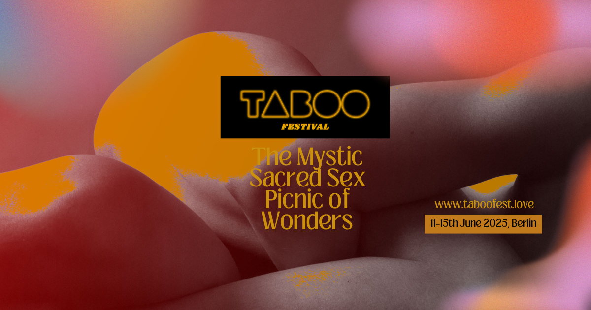
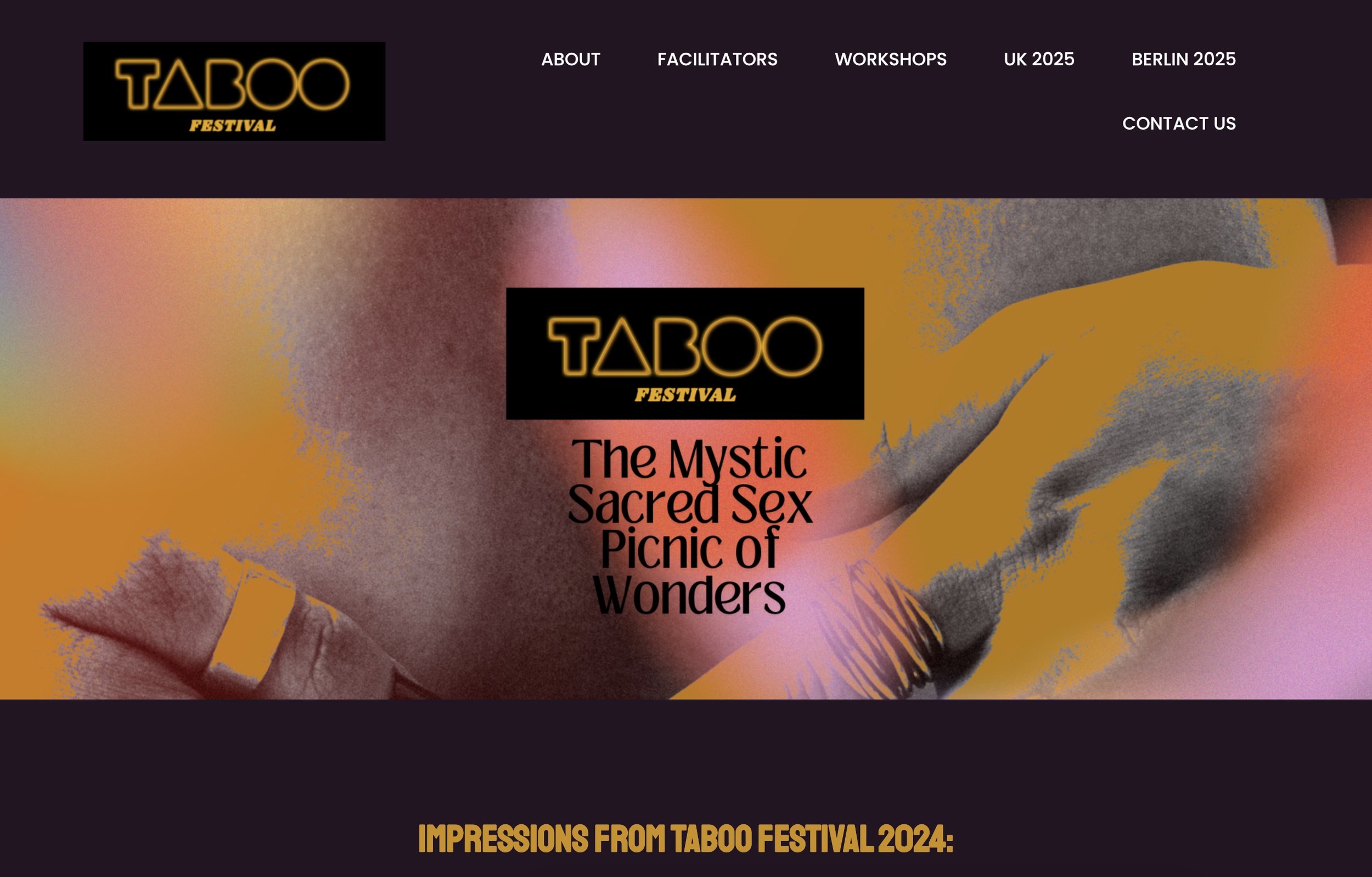
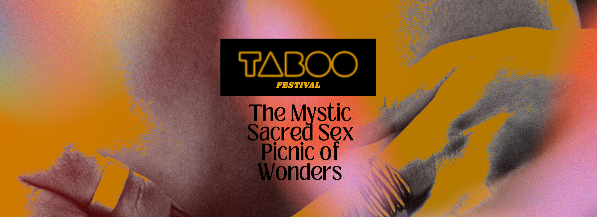
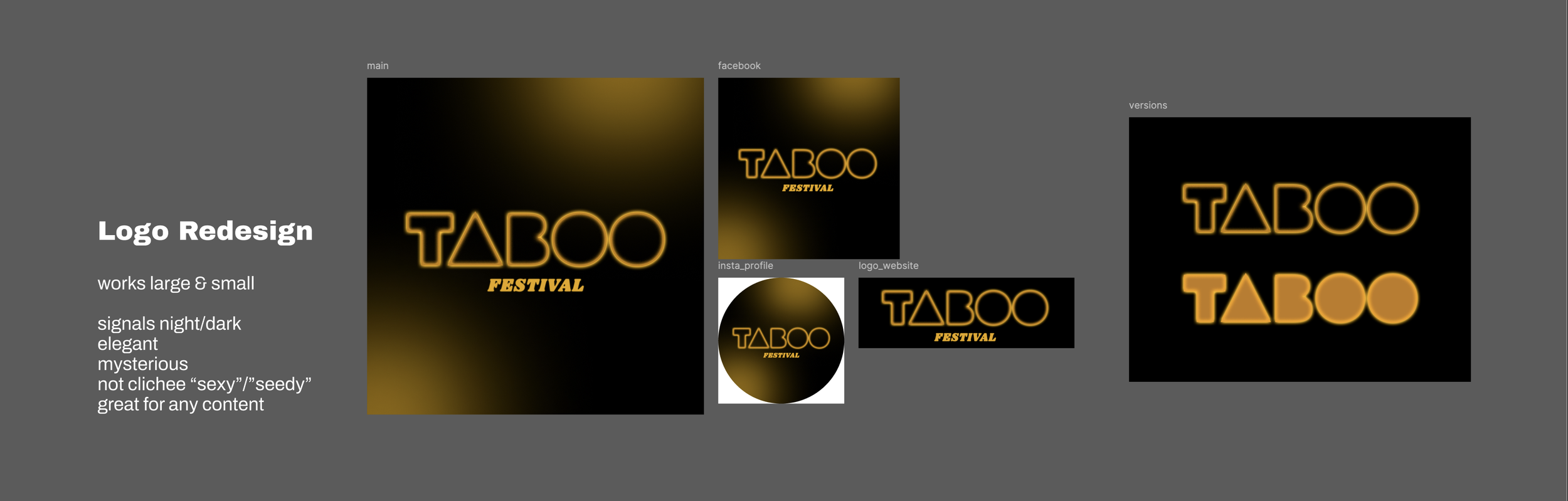
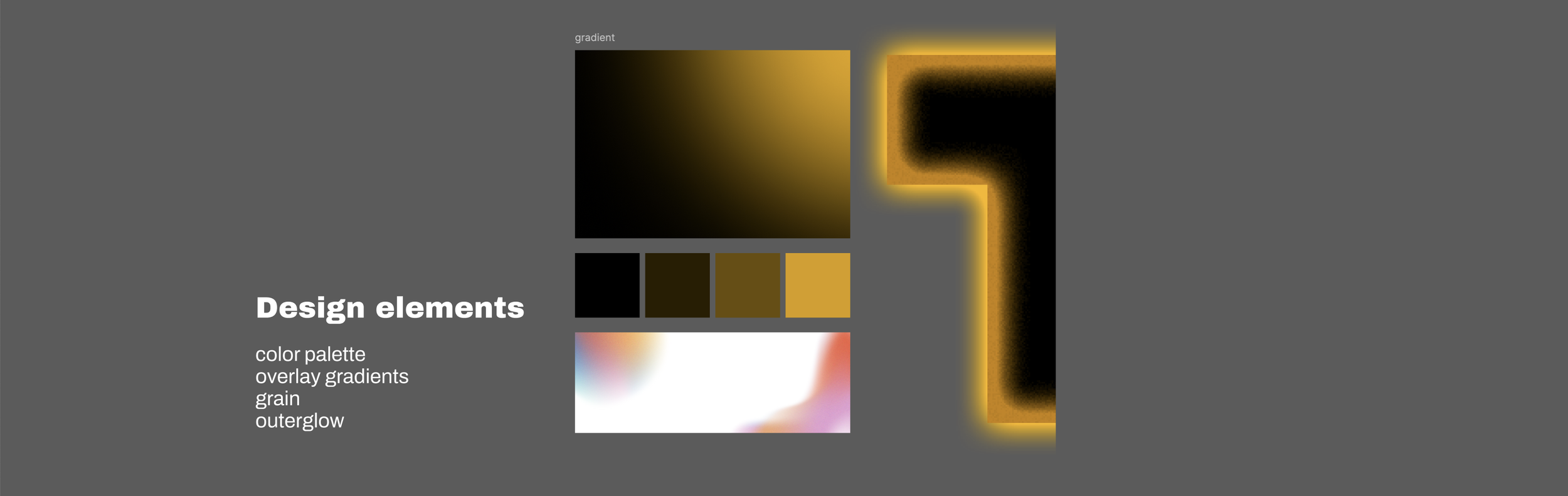
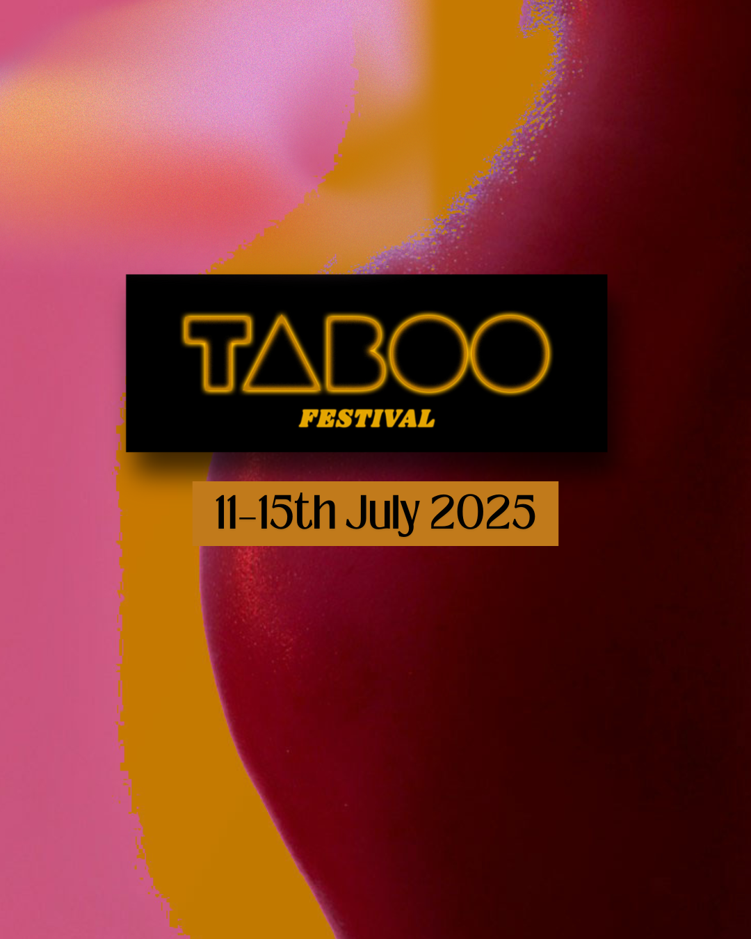
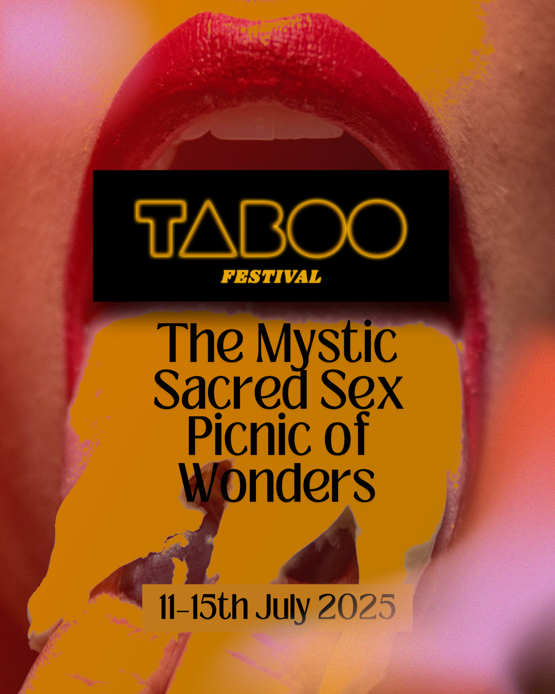
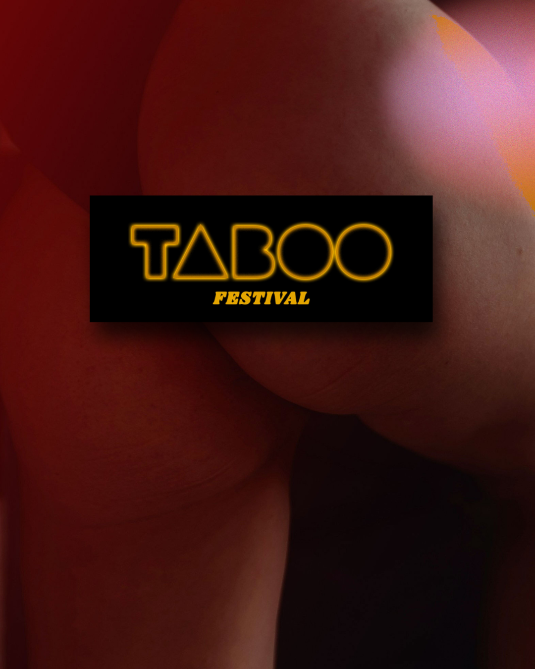
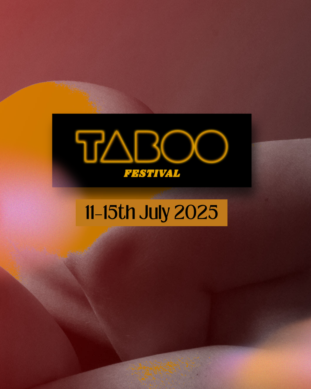
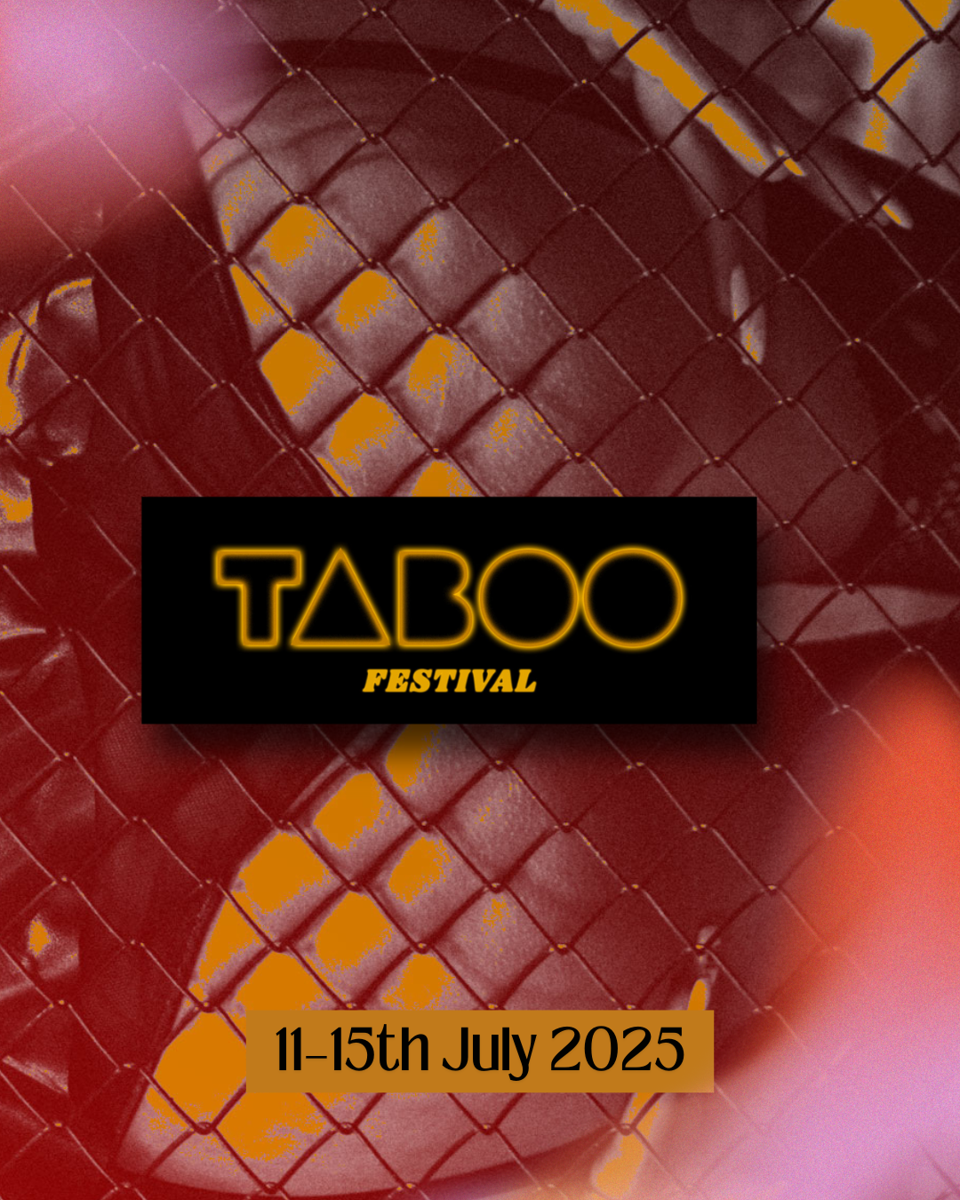
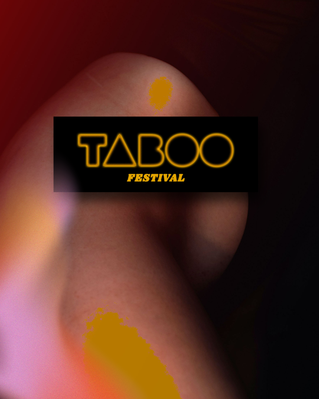
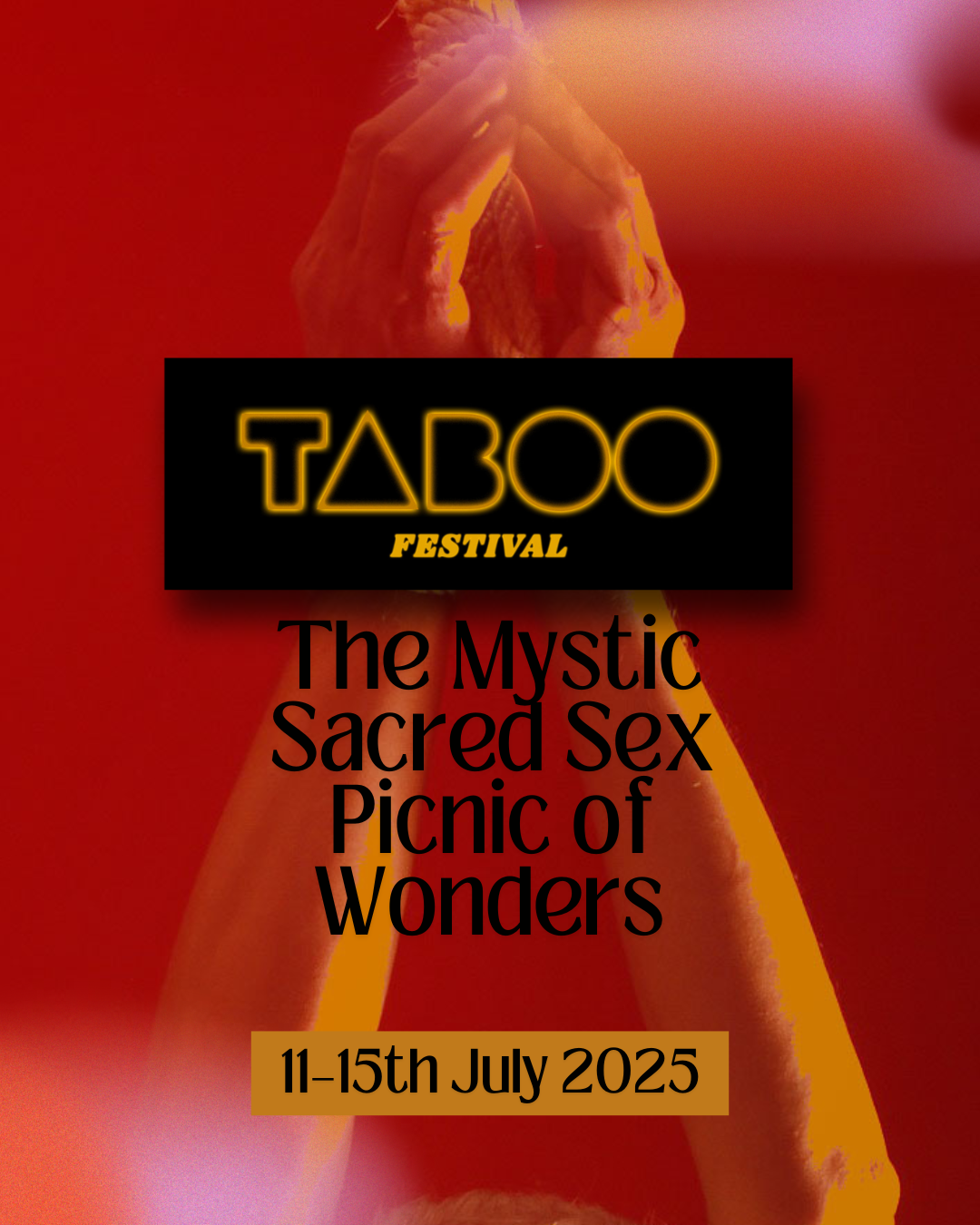
Finding the right look for TABOO
It was important, that the festival - albeit being a sex-positive festival - not look clicheed, seedy or what counts as “commercially sexy”. The festival hosts also value spirituality and sensuality and finding a way to combine these themes was my challenge.
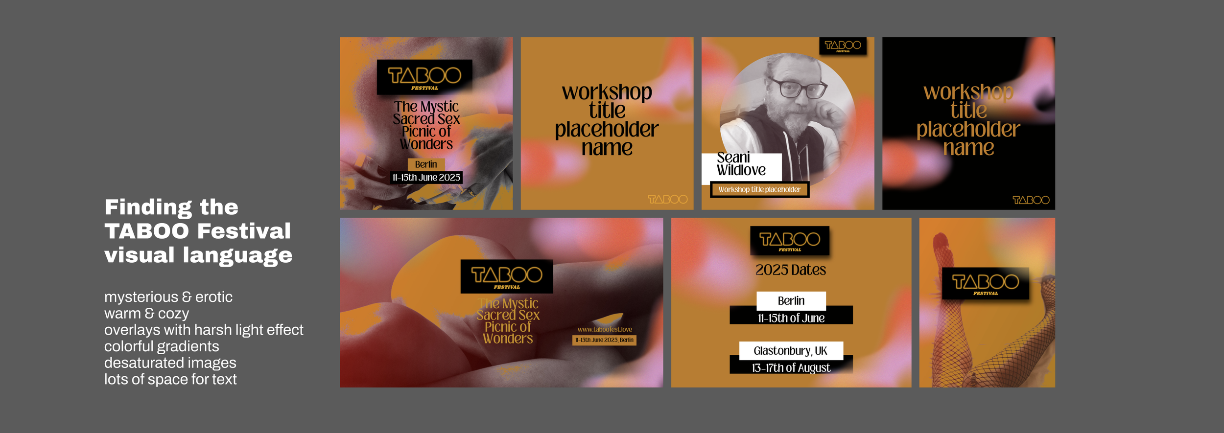
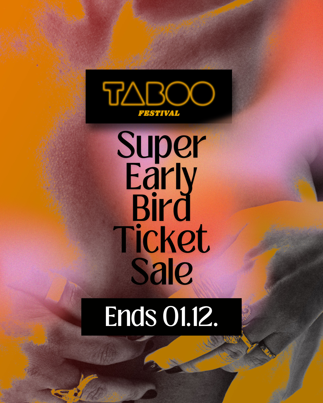
Taboo visuals in action:
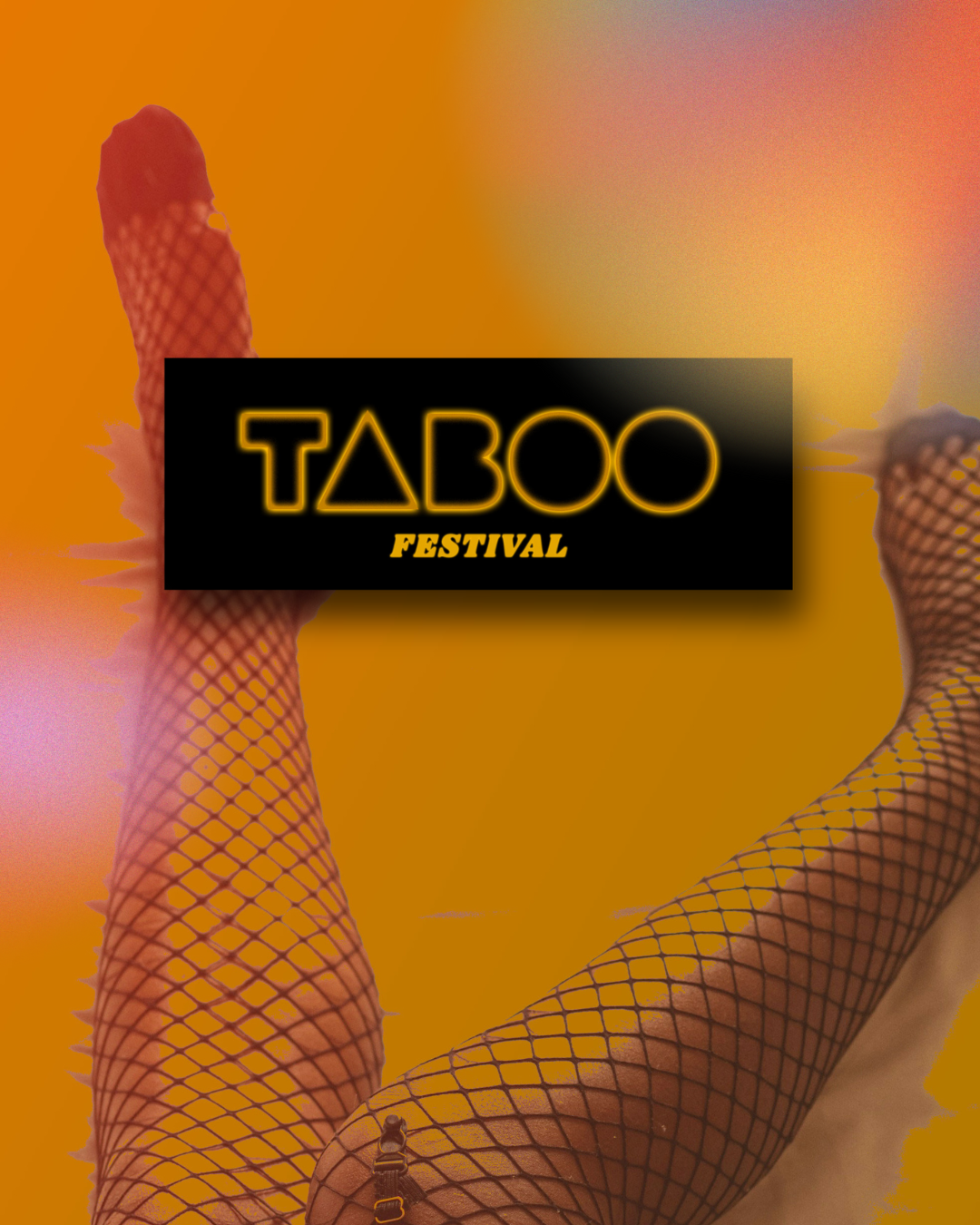
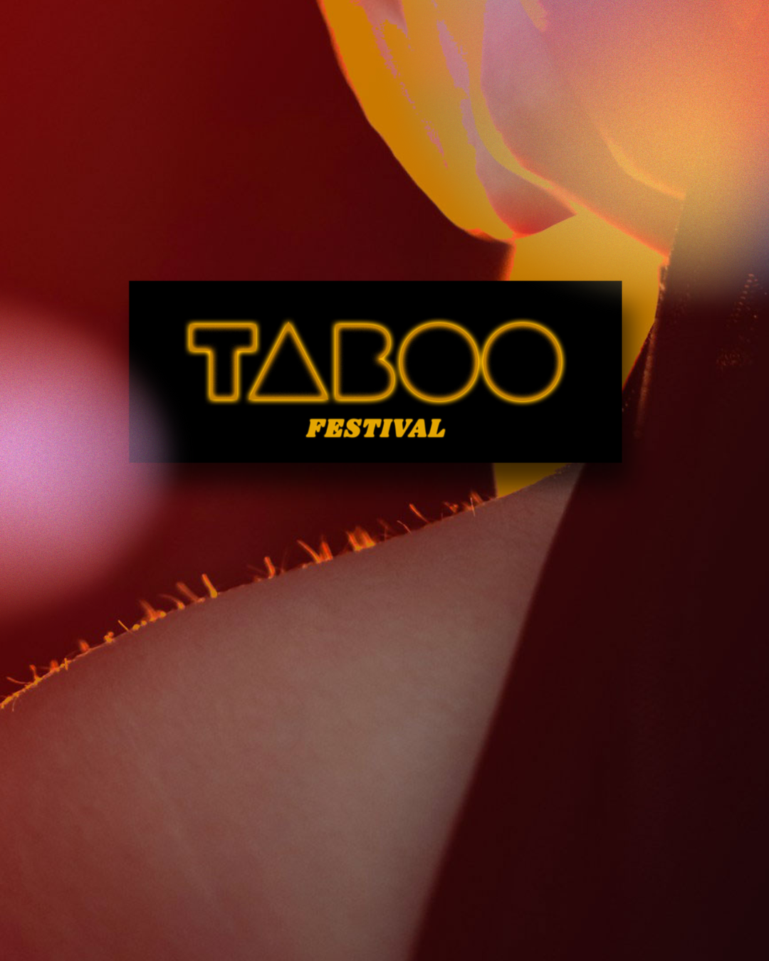
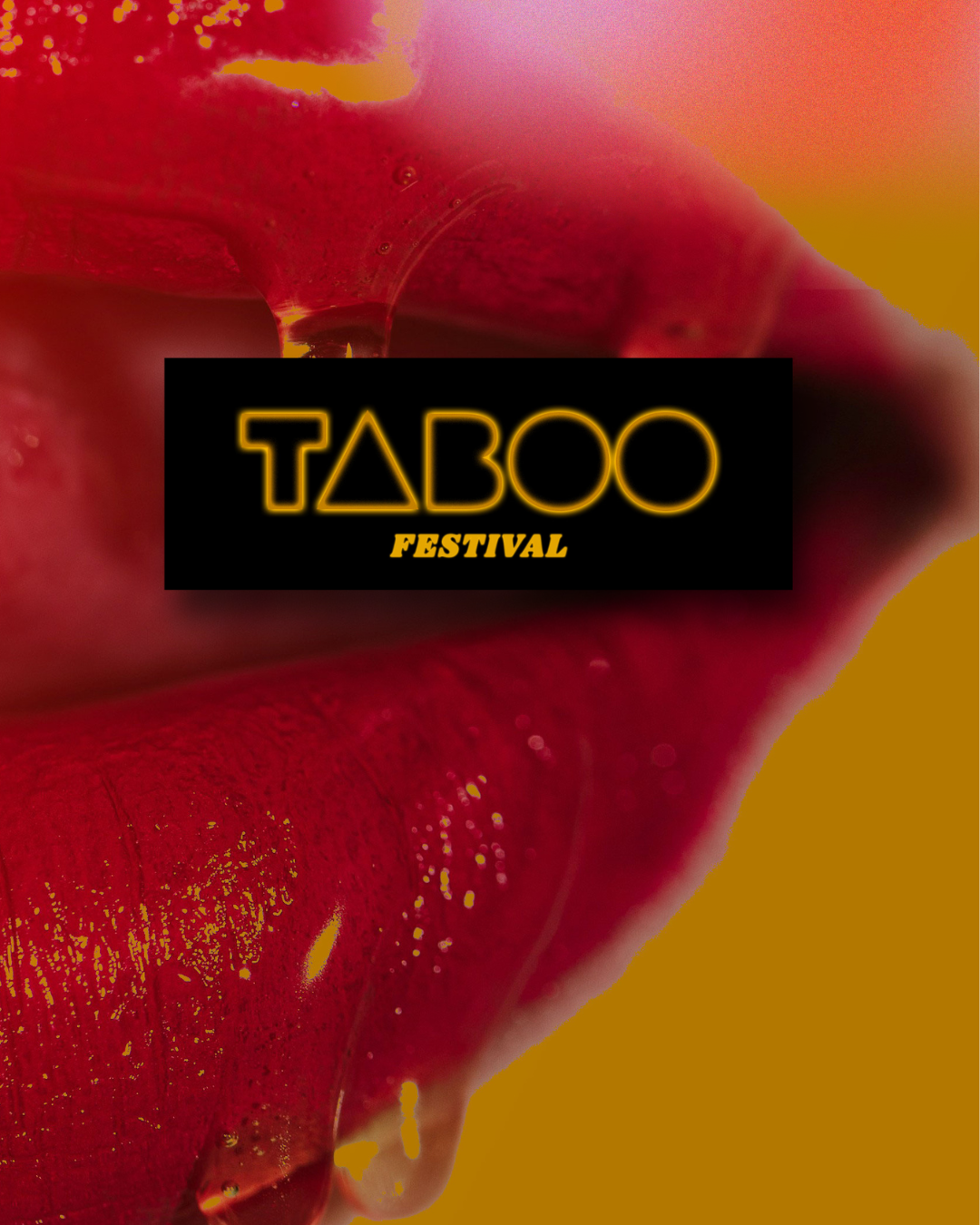
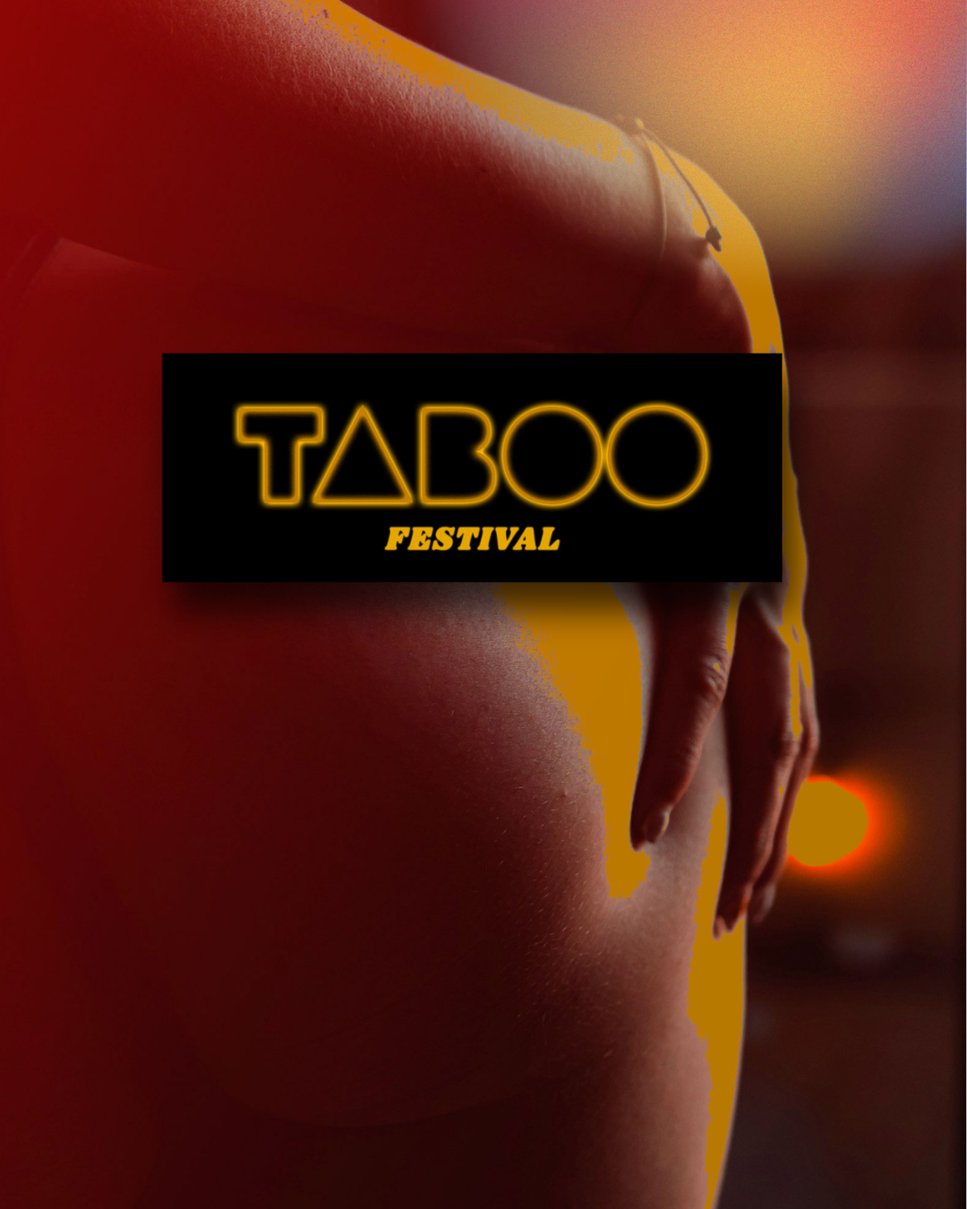
Adjusting the design Across multiple platforms